
Component Edition
Configure individual form components: fields, options, pricing and logic.
Mastering Component Customization: Your Comprehensive Editing Guide
Editing Components
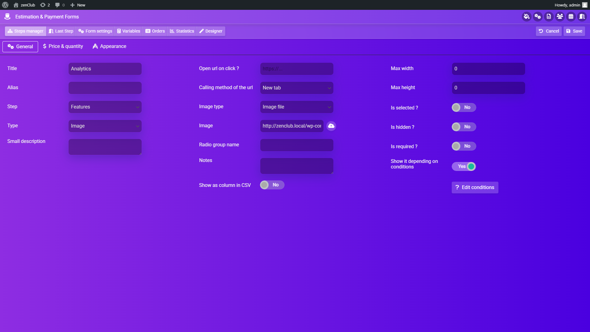
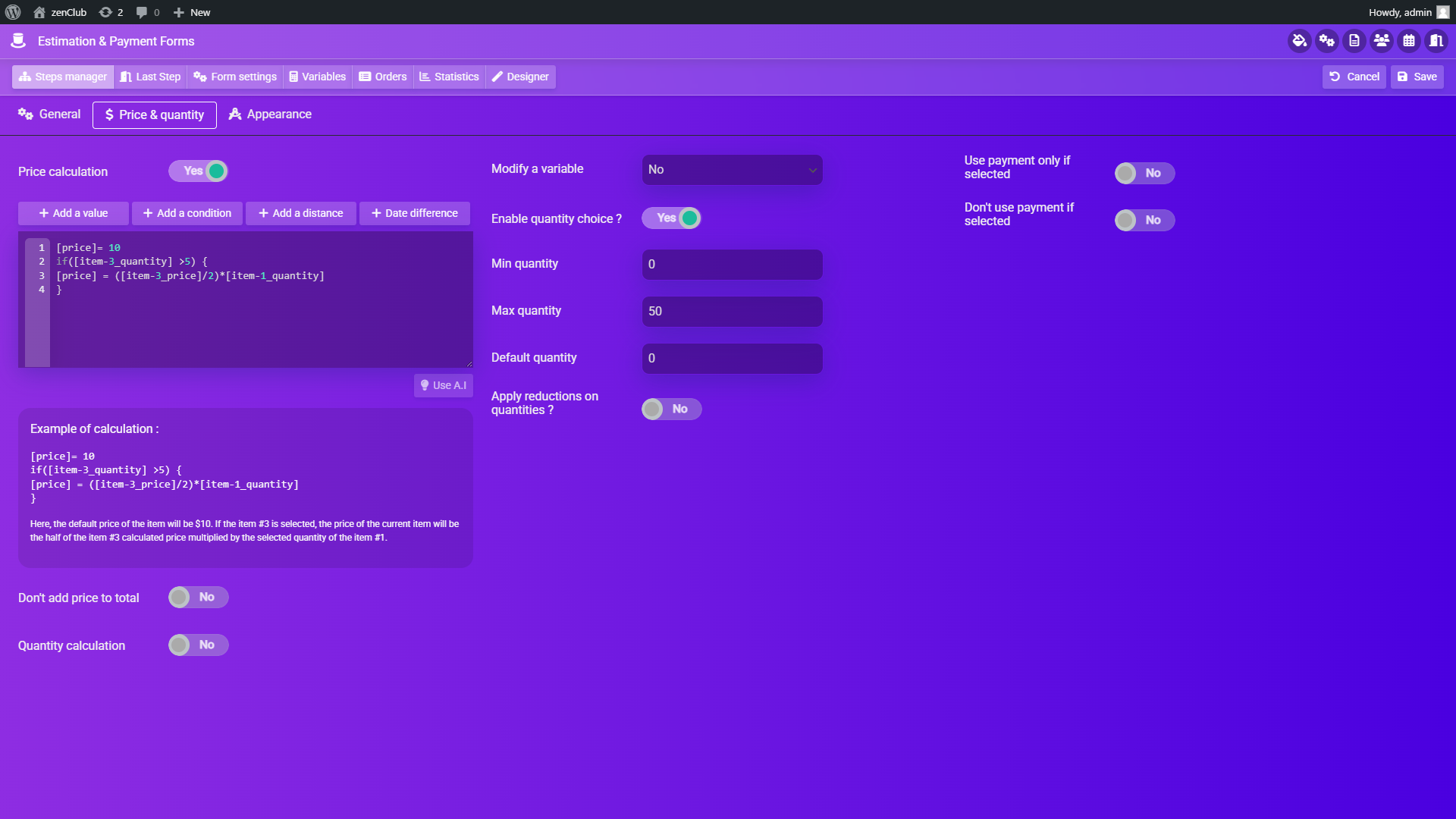
Upon clicking the pencil button on a component, you'll access the component edition panel:
Component Edition Panel - General Tab
Component Edition Panel - Price Tab
Navigating the Component Edition Panel
The toolbar buttons facilitate navigation between the different tabs of the component edition panel:
Component Edition Panel Tabs
General settings
Price & quantity settings
Appearance settings
Dynamic Options Interaction
All options within these tabs are dynamic and may interact with each other. For instance, selecting "Slider" in the "Type" option reveals price and quantity options in the "Price & quantity" tab, whereas selecting "Custom content" hides these options. Hover over an option to view more details about it.
Highlighted Component Options
Step
Enables relocating the selected component to another step.
Type
Changes the type of the selected component while preserving filled values in other options, allowing reversion while maintaining settings.
Radio Group Name
Assigning the same value to this option across multiple components restricts the user to select only one component at a time.
Price Calculation
Configures a dynamic unit price for the selected component.
Quantity Calculation
Similar to price calculation but sets the default quantity of the selected component.
Modify a Variable
Works like the price and quantity calculation options, but its result sets the value of a custom variable.
Apply Reductions on Quantities
Allows setting a different unit price based on the user-filled quantity. Enter the desired minimum quantity and new unit price, then click the "Add reduction" button.
Type of Information
Specific to text fields, it helps the plugin identify the data type collected for integration with Zapier, MailChimp, etc.
Validation Mask
Appears when "Type" is set to "Text field" and "Validation" is set to "Mask", enabling custom validation masks configuration. Documentation on masks is available on the jQuery plugin website.
Show in Email/Summary
If enabled and the item is selected, it will appear in the optional summary in the final step, and in the email sent to the admin and customer upon form submission.
Tooltip Text
Text entered here will be displayed in a tooltip when the user hovers over this component.
Display Price in Title
If the component has a static price, it will show in its title. However, if the price is calculation-based, it will appear in the title only when the component is selected.
Pro Tip: Take time to explore all the component options. The dynamic nature of the options means that different component types will reveal different settings, giving you powerful customization capabilities.